The Descent Of Spongebob's Character Design

BabySmitty

Porous Freak
Joined
May 8, 2014
Messages
3,891
Likes
3,597
Location
Goofy Goober's Ice Cream Party Boat
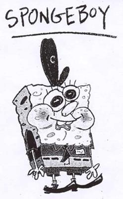
I thought I'd do a post illustrating what went wrong with Spongebob's character design. This largely has to do with who's drawing him and what his model sheet looks like. So take it with a grain of salt.

oh look at this, he's got a nice goofy design, very cute and awkward-looking

SpongeBoy_by_Stephen_Hillenburg.jpg


his pilot design takes what was charming about his rougher design, and polishes it slightly, while keeping some of the wobblyness

http://www.sbmania.net/pictures.php?img=34kO0t%2Bv6jp2WKkHpxoXge7NViGKf1n6Anl0f9r2ic8%3D

His early show design from season 1 polishes his pilot design a bit, but still retains the wiggliness

http://www.sbmania.net/pictures.php?img=xD7WWQjLfMJZADD3wK4Hk%2FwDLFGOJSV7xS5drpmiIcU%3D

His design in early season 2 looks very similar to his season 1 design. Despite the show's transition to digital ink and paint, his design still looks organic. His color is a bit washed-out, but we can chalk that up to malnutrition and Krabby Patty-induced anemia.

http://www.sbmania.net/pictures.php?img=F1KsZDpHtztx0dE2fpDZesCIL9UVhaeubk%2F3dftkLio%3D

Spongebob's design in season 2 also brought us the distinctive Greenblatt Spongebob. His design originated in an episode directed by Erik Wiese, so... perhaps his chubby-cheeked design was the decision of Erik, or maybe even Hillenburg himself. This design has the tendency to frequently go off-model in humorous, cute, and appealing ways, and is fun to watch.

http://www.sbmania.net/pictures.php?img=knMPgLjLvrqATWlfS9vIEU7ilMDI4pFHXs0pvV5Mgbc%3D

Starting in mid season 2, Spongebob lost a lot of his organic imperfection, leading to a very polished yet very stiff design.

http://www.sbmania.net/pictures.php?img=qq89zwqHTm9NY%2BFfxfJtuprywbdxR8zb03DiDr4OpIY%3D

In season 2, it was like someone took an iron and ironed out Spongebob.

http://www.sbmania.net/pictures.php?img=Tf30waiBZcuAIT1vWPTWVj7UVKyODRwIF%2BYlIAgmF5c%3D

Season 3, (with mostly Greenblatt's episodes as an exception,) gave us a Spongebob design that was stiff as a board and very rigid-looking.

http://www.sbmania.net/pictures.php?img=wZZ1lNg2BrBh9VSvtagYUFtVkqwmrVLd2WMlA4aoB7g%3D

Spongebob's design in the first movie is ... odd. Proportionately he looks much shorter, his cheeks are chubbier, he looks more box-like; but his face is extremely expressive. He's got Sherm Cohen's fingerprints all over him. His body shape is also a LOT less consistent. It changes from shot-to-shot.

http://www.sbmania.net/pictures.php?img=XxMtsz%2B0e%2FTJ5u7gTdCI0PXOhfkfWk2CFlG6quaFe90%3D

In season 4, Spongebob's design looks like a mish-mash of his movie design and Greenblatt's design. He isn't too stiff, and he's very expressive. His proportions seem to change frequently, too.

http://www.sbmania.net/pictures.php?img=ATchgTupZMFDutyYvsUJFQj%2FaPHH9hfVpKnll0udmHA%3D

In season 5, Spongebob's design is pretty similar to how it was in season 4.

http://www.sbmania.net/pictures.php?img=NM7caC60rFy8yYfTwLAOQlg81FOfSApqiu%2B9TbCbtyA%3D

In season 6, something went really, REALLY wrong, and Spongebob turned into.... this...

http://www.sbmania.net/pictures.php?img=%2F0DOf6M4ur%2FfwpCuAvWJQRum4wEC0cVY4icB8hUnlQg%3D

His eyes got smaller, his eyelashes got thicker, his proportions and shape became much more rigid, and his eyes look.... dead. This design carried into season 8. Why, Aaron Springer?!

http://www.sbmania.net/pictures.php?img=9V%2FkY04nG%2FaDJfUhp0RWYvIUgx2cBq8gYuZ1AycEFp0%3D

Poor, ugly thing. Even in the highly-regarded episode "Treats!," Spongebob looks UGLY.

http://www.sbmania.net/pictures.php?img=Aa4zjht1%2FSp4BH6nReXBzP%2BejEjgZV0e2AOc1Z0E66Q%3D

As much as I hate "Sponge out of Water," it gave Spongebob's design a much-needed makeover. Sherm Cohen came back on board to make Spongebob look cute and huggable again.

And fortunately, his shiny new design has carried over into the post-second-movie episodes.

https://www.youtube.com/watch?v=VKcqoNL8enA
 

Loopers

Sportz?
Joined
Sep 22, 2015
Messages
777
Likes
1,062
Location
Quahog
Wait, what the heck is digital-ink-and-paint
I know it shows better graphics, but instead of drawing on tablets, were the drawings scanned?
 

BabySmitty

Porous Freak
Joined
May 8, 2014
Messages
3,891
Likes
3,597
Location
Goofy Goober's Ice Cream Party Boat
Loopers23 said:
Wait, what the heck is digital-ink-and-paint
I know it shows better graphics, but instead of drawing on tablets, were the drawings scanned?
As far as I know, Spongebob is still animated on paper and drawn with pencils. The outlines and the paint are done on a computer.

Season 1 was cel-animated, with traditionally painted outlines and colors. Starting with season 2 ("Your Shoe's Untied," "Squid's Day Off,") the show switched to digital ink and paint.

hope that clears up any confusion.
 

BobCarotte

meep
Joined
Aug 14, 2014
Messages
5,250
Likes
4,846
Location
Québec
BabySmitty said:
In season 6, something went really, REALLY wrong, and Spongebob turned into.... this...

http://www.sbmania.net/pictures.php?img=%2F0DOf6M4ur%2FfwpCuAvWJQRum4wEC0cVY4icB8hUnlQg%3D

His eyes got smaller, his eyelashes got thicker, his proportions and shape became much more rigid, and his eyes look.... dead. This design carried into season 8. Why, Aaron Springer?!

http://www.sbmania.net/pictures.php?img=9V%2FkY04nG%2FaDJfUhp0RWYvIUgx2cBq8gYuZ1AycEFp0%3D
Don't forget the cheeks.

http://www.sbmania.net/pictures.php?img=IYENv2q4vqo8AjfxcWZzknhOAgH2bQnwq47kQ9bOtV4%3D
 

BabySmitty

Porous Freak
Joined
May 8, 2014
Messages
3,891
Likes
3,597
Location
Goofy Goober's Ice Cream Party Boat
SantaCarotte said:
Don't forget the cheeks.

http://www.sbmania.net/pictures.php?img=IYENv2q4vqo8AjfxcWZzknhOAgH2bQnwq47kQ9bOtV4%3D
The cheeks I don't actually mind too much. It's everything ELSE about this design that I hate.

Because from the very beginning Spongebob has been drawn with stupid chubby cheeks.
 

ScumBob

sicko m0de
Joined
Mar 6, 2014
Messages
2,805
Likes
3,082
Location
in your house
I can't disagree, SpongeBob looks ::dolphin noise:: stupid in some of season 6, 7, and 8.
 

CartoonJazzLover

Balloon Traveler
Joined
May 1, 2008
Messages
1,200
Likes
532
Location
Laredo, TX
I been looking at some gallery on SpongeBob Wikia to see some difference and I can tell what season it is. I can always tell season 1 design by the smiles SpongeBob made (like the one third one pictured), aside from the cels art-style. In fact, the season 1 smile is sometimes used in later episodes (even a few times in post-movie). In season 2, SpongeBob's design is easily described as irregular yellow. The color stylists can't seem to made up their mind what shade of yellow SpongeBob is suppose to be, so they sometimes made him yellow-green. Season 3 is described as the most refined yellow in the first era. I say that because the yellow shading in that season is an improvement compared to seasons 1/2. As for facial expressions go, I can always tell it's CH Greenblatt if there's wacky drawings.

For the movie, it's probably an early look of how he would look in the next couple seasons. In season 4, there are a lot of memorable facial expressions, especially the season premiere. Almost none of them are too lifeless and stiff. Season 5 especially the first half looks close to season 4. By the second half, SpongeBob doesn't look like season 4 anymore. And of course, we know what happens by season 6. While he is expressive from time to time, there's that stupid look on his face in some of the Springer episode. I think the most on-model he was in that season are the later Brookshier/Cash episodes. Season 7 officially start the "boring" art-style that we have to look at for a couple (and a half) seasons. Though by season 9, in certain episodes like Eek an Urchin!, Kenny the Cat, SpongeBob does made a few season 4-esque faces. That is not until the post-sequel era started and he and the other characters are 10 times more expressive as they were in the past few seasons.
 

ScumBob

sicko m0de
Joined
Mar 6, 2014
Messages
2,805
Likes
3,082
Location
in your house
BabySmitty said:
The cheeks I don't actually mind too much. It's everything ELSE about this design that I hate.

Because from the very beginning Spongebob has been drawn with stupid chubby cheeks.
I think the only problem with the cheeks is how they're used. They shouldn't appear when he's not smiling or if he doesn't have a huge af grin on his face.

Otherwise they can be obnoxious at times
 

BabySmitty

Porous Freak
Joined
May 8, 2014
Messages
3,891
Likes
3,597
Location
Goofy Goober's Ice Cream Party Boat
SantaCob said:
They shouldn't appear when he's not smiling or if he doesn't have a huge af grin on his face.
I can see why you'd think that, but honestly, the cheeks don't bother me, surprisingly enough. It's everything else (the stiff design, dead, small eyes, thick lashes, annoying dialogue) that bother me.
 

BabySmitty

Porous Freak
Joined
May 8, 2014
Messages
3,891
Likes
3,597
Location
Goofy Goober's Ice Cream Party Boat
illiniguy34 said:
Dem cheeks.
he has the cutest rosy chubby cheeks, doesn't he?

http://www.sbmania.net/pictures.php?img=gulnOcvnODYwMyZDbSHI7qQ8%2BiJ4Um15D1Kdd0Nw3Nw%3D

http://www.sbmania.net/pictures.php?img=WHEbIpV8UPkVGPXwb5lEYbhmbw0KLd%2B7HJN4700oroA%3D

http://www.sbmania.net/pictures.php?img=t1gGG0rKBEj8%2BzD5FfieOGd%2Fxvf8ErsTkjt5K0hDRMA%3D
 

2000sKid

Giant Clam
Joined
Dec 24, 2013
Messages
609
Likes
173
Location
NJ
My favorite is Season 1, it seems like it has all of the best qualities of Spongebob on one character
 

The Drifter

Some person.
Joined
May 22, 2013
Messages
6,733
Likes
5,626
Location
Magic Town
Although I still despises season 1's awful coloring and how it looks cheap, I think the animation and character design are generally great. It looks very cartoony, unlike season 6-7 animations where they're in an anime-level stiffness.
 

DadMom AngryPants

Hi, I'm normal.
Joined
Nov 24, 2009
Messages
9,319
Likes
12,723
Location
UK
One of the most appealing things about SpongeBob's design is that his face is (or was ...) so big in proportion to his body. ("Excuse me, sir. You're sitting on my body, which is also my face.") So it always looks wrong to me when his eyes and facial features in general are too small and don't take up enough of his face. It makes his body look too big as a consequence (though I think his body is too big in some episodes, too) and usually isn't as cute or expressive.

This is just in general, of course. There are so many subtle changes that happened over a long period of time that it's hard to pinpoint what exactly makes the later examples you posted so unappealing. They just are.

He definitely lost his trapezoidal shape at some point.
 

BabySmitty

Porous Freak
Joined
May 8, 2014
Messages
3,891
Likes
3,597
Location
Goofy Goober's Ice Cream Party Boat
2000sKid said:
My favorite is Season 1, it seems like it has all of the best qualities of Spongebob on one character
My favorite is the original concept sketch. He just looks like such a doofus, I want to hug him.

The Drifter said:
Although I still despises season 1's awful coloring and how it looks cheap, I think the animation and character design are generally great. It looks very cartoony, unlike season 6-7 animations where they're in an anime-level stiffness.
I strongly disagree- I think season 1 in general had GORGEOUS colors. They were bright and vivid without hurting one's eyes.

DadMom AngryPants said:
One of the most appealing things about SpongeBob's design is that his face is (or was ...) so big in proportion to his body. ("Excuse me, sir. You're sitting on my body, which is also my face.") So it always looks wrong to me when his eyes and facial features in general are too small and don't take up enough of his face. It makes his body look too big as a consequence (though I think his body is too big in some episodes, too) and usually isn't as cute or expressive.

This is just in general, of course. There are so many subtle changes that happened over a long period of time that it's hard to pinpoint what exactly makes the later examples you posted so unappealing. They just are.

He definitely lost his trapezoidal shape at some point.
Spongebob's design in the first movie encompasses so much of what I generally hate in a Spongebob design, but it also incorporates so much of what I LOVE in a Spongebob design.

His eyes are a lot smaller, his shape is very boxy and even kind of stiff at times, his whole face, proportionately, gets really small sometimes.

Yet... the way he's drawn in the movie is so interestingly inconsistent, expressive, and fun to look at, that I don't really care. I also love that his design is so asymmetrical in more subtle ways. It makes him look so much more organic.


The-SpongeBob-Movie-spongebob-squarepants-786464_800_482.jpg
 

MasiHosseini

Krabby Patty Burglar
Joined
Aug 8, 2013
Messages
2,453
Likes
639
Location
Arnhem
IMO, the best designs are in Season 3/Season 4. But the S6 designs in many episodes look hideous, even with good episodes in the season.
The animation in "Sand Castles In The Sand" was awesome in my honest opinion.
 
Back
Top