The Descent Of Spongebob's Character Design

BabySmitty said:
I don't know what went wrong. Paul Tibbitt? Aaron Springer? Network interference? I'm glad that design is gone.
Network interference and a budget cut. Some of the animators also changed the drawings so they'd be stiffer and easier to animate. Nick wanted a cheaper show.


BabySmitty said:
As far as I know, Spongebob is still animated on paper and drawn with pencils. The outlines and the paint are done on a computer.

Season 1 was cel-animated, with traditionally painted outlines and colors. Starting with season 2 ("Your Shoe's Untied," "Squid's Day Off,") the show switched to digital ink and paint.

hope that clears up any confusion.
Yes, it's still animated on paper, but it's also inked traditionally. It's colored and composted using Toon Boom.
 
As far as I know, Spongebob is still animated on paper and drawn with pencils. The outlines and the paint are done on a computer.

Season 1 was cel-animated, with traditionally painted outlines and colors. Starting with season 2 ("Your Shoe's Untied," "Squid's Day Off,") the show switched to digital ink and paint.

hope that clears up any confusion.

Season 1 was completely done on paper, hand-drawn and colored with store-bought paint, and then each frame was photographed individually on film

Seasons 2-5 were drawn with pencils, then scanned into a computer to be colored

Season 6 is when they switched to tablets
 
BabySmitty said:
he has the cutest rosy chubby cheeks, doesn't he?


Don't forget this:
Tutor_Sauce_100.png


Any way. I like the pilot and Greenblatt design, looks more funny and it is not very symmetrical.
And you forget the season 9.2 design:
Tutor_Sauce_215.jpg

In my opinion is very similar to the season 2 design but more esthetic.
But occasionally is used this other design that is very similar to the first movie:
190a%20-%20Lost%20in%20Bikini%20Bottom%20236.jpg

What do you think of these?
 
Grumpy Squidward Guy said:
Season 1 was completely done on paper, hand-drawn and colored with store-bought paint, and then each frame was photographed individually on film

Seasons 2-5 were drawn with pencils, then scanned into a computer to be colored

Season 6 is when they switched to tablets
Ohhhh I see
And Pest to the West was a Season 5 episode, and that was the first episode to use tablets, right?
 
Fred Mercury said:
I don't see any wrong thing with S6-8 Design, I just want to watch it.
Exactly, those design give me less willing to see them. I just don't know why ._.
 
Spongebob's design was pretty inconsistent in the pre-movie era and I really like that. I have no problem with Spongebob being more symmetrical since 2005, but the stiffer animation bothers me a bit.
As for Spongebob's cheeks, I don't care how they look, as long as they're not on places they shouldn't.
 
The_Swedish_Spongebob_Fan said:
Spongebob's design was pretty inconsistent in the pre-movie era and I really like that. I have no problem with Spongebob being more symmetrical since 2005, but the stiffer animation bothers me a bit.
As for Spongebob's cheeks, I don't care how they look, as long as they're not on places they shouldn't.
I agree with pretty much all of this.
 
Personally I like the post 2nd movie design the most. S6-S8 SpongeBob just creeps me out though.
 
Post-2nd, SOOW, Movie and Season 4 designs are best imo, the lines are cleaner but bouncy, the design of SpongeBob's face is cute and while sometimes stiff it's nice to see a change after season 6-9-ish's stiff design.
 
DigitalDistraction said:
Post-2nd, SOOW, Movie and Season 4 designs are best imo, the lines are cleaner but bouncy, the design of SpongeBob's face is cute and while sometimes stiff it's nice to see a change after season 6-9-ish's stiff design.
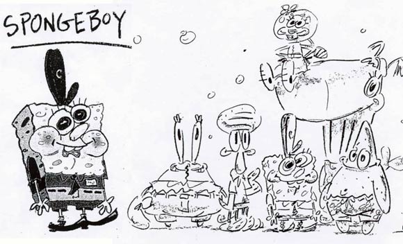
I honestly think the concept art is the best Spongebob look. The designs are just so freaking charming and adorable.

spongebob-oralhistory2.jpg


Honest Slug said:
S6-S8 SpongeBob just creeps me out though.
same!

I'm also not fond of Spongebob's design in late season 2 and early season 3. Very stiff.
 
I'm all right with SpongeBob's Season 1 design, however, I would typically use it more as an interpretation of SpongeBob's past (like Tracey Ullman Simpsons and Classic Sonic), and not really want to use it seriously. There are actually three seperate versions of this design I've noticed- The "Help Wanted" one, the one used from Tea at the Treedome-I Was a Teenage Gary in which he was less wavy and had thinner lines, and the one used in Reef Blower and SB-129-Mermaid Man & Barnacle Boy II, which was wvier with thicker lines. I wish I could show a comparision, but I don't know how to. Personally I like the "Reef Blower" design more.

Early Season 2 (ending around Grandma's Kisses/Squidville) is pretty much a turning point between Season 1 and mid-Season 2.

Late Season 2/Early Season 3 and Season 4 are my personal favourites, besides the occasional eyebrows in Season 4's case. Late Season 3 (starting around about Ugh) is one I'm not very fond of. I don't know what it is, but he sort of looks a little fatter. I'm not even sure if there's a difference, or if my mind just links it to the end of the show's original run.

As for Season 6, if you take away the "Springer Cheeks" as I call them, it's probably his most boring design. There's nothing I can really say about it. Do I like the Springer Cheeks just in general? If they're close to his eyes and he's smiling, I'm okay with it, but I don't think it works when he's frowning. He looks a little creepy to be honest.

Season 9b is sort of a 70/30 of the Season 6 and the Late Season 2/Early Season 3 design, which I'm currently all right with. Vincent Waller said that there's a technical reason why they can't go back and use the early designs, and until they make a design which is slightly more in line with Late S2-Early S3, I'm not going to complain.

On the subject of SpongeBob's design, have you noticed the change on merchandise? Before Season 4, it was flat colours, during Season 4-5 there was a little more depth and shading, and from Season 6 to the present day, there's a ton more shading and more realistic features for SpongeBob (like several different shades of his eye colour and having a uvula more frequently). Although I'm not going to lose sleep over it, I really wish they bring back the Season 4-5 design. However, that's just me. I haven't seen a lot of people talk about it so I don't know others' opinions, but it's good they aren't whining about it, like I was slightly.
 
EmployeeAMillion said:
Season 9b is sort of a 70/30 of the Season 6 and the Late Season 2/Early Season 3 design, which I'm currently all right with. Vincent Waller said that there's a technical reason why they can't go back and use the early designs, and until they make a design which is slightly more in line with Late S2-Early S3, I'm not going to complain.
Correct me if I'm wrong but I swear that I heard somewhere that Vincent Waller said they'll bring back the seasons 2-3 design sometimes in season 10.
 
Correct me if I'm wrong but I swear that I heard somewhere that Vincent Waller said they'll bring back the seasons 2-3 design sometimes in season 10.
I don't think so. I think he's referring to the Season 9b (or as a lot of people on SBM seem to call it, Season 9.2) design having more of a classic feel to it.
 
EmployeeAMillion said:
Late Season 3 (starting around about Ugh) is one I'm not very fond of. I don't know what it is, but he sort of looks a little fatter. I'm not even sure if there's a difference, or if my mind just links it to the end of the show's original run.
Hey, he's the star of Nickelodeon's biggest money-maker, so he's probably still dealing with a ton of pressure from fans and executives. It's no wonder why the stress of the limelight caused him to put on weight. lol

but yeah, I feel like the merchandise has gotten a lot more interesting
 
Also, what really bothers me about Spongebob's new design the most is when he makes this face:

WXXNVv7.png

I'm pretty sure his huge pupils and his weird grin are what makes his design so creepy now. Good thing Season 9b used it less though.

Here's a side-by-side comparison between that and just Spongebob with his new round cheeks:

KN75XRd.png
it all depends on the artist drawing him. Bob Camp uses the old design. Love the drawings by the way.
 
Back
Top