You are using an out of date browser. It may not display this or other websites correctly.
You should upgrade or use an alternative browser.
You should upgrade or use an alternative browser.
Pinned thread Art Style analysis in Spongebob and various other shows
- Thread starter Original Raw and Uncut
- Start date
Fear Of A Nerdy Patty
Bomb-Selling Pirate
It also switches between the early digital artstyle seen in Your Shoe's Untied and the stardard season 2 artstyle.
Original Raw and Uncut
Two-Headed Starfish
It also switches between the early digital artstyle seen in Your Shoe's Untied and the stardard season 2 artstyle.
When Spongebob is in the kitchen, it switches to the same art style as Sailor Mouth
Original Raw and Uncut
Two-Headed Starfish
Fear Of A Nerdy Patty
Bomb-Selling Pirate
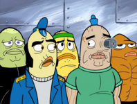
Yeah, it's kinda weird how the navy men are drawn. It shows how the art direction was already going through a major overhaul, even though the transition hadn't set in completely yet.
Original Raw and Uncut
Two-Headed Starfish
Original Raw and Uncut
Two-Headed Starfish
Spongebob's design in "Karate Island" is the same as it was in "The Great Snail Race"
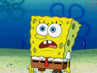

2002 Toonz Premium Design (left) Toon Boom 2006 design (right)
Notice how Toon Boom has a higher resolution which is why Spongebob's squiggles are smoother. The backgrounds in season 4 also look smoother than season 2/3. Spongebob is also a warmer shade of yellow in season 2/3.
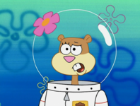
Sandy's head is also a lot bigger in season 2 and 3 than it is in Season 4.


Fear Of A Nerdy Patty
Bomb-Selling Pirate
Her nose gets smaller too.
Original Raw and Uncut
Two-Headed Starfish
Fear Of A Nerdy Patty
Bomb-Selling Pirate
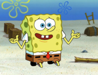
Is that the first appearance of those big season 5 buckteeth?
Original Raw and Uncut
Two-Headed Starfish
Is that the first appearance of those big season 5 buckteeth?
I think that is
Original Raw and Uncut
Two-Headed Starfish
Original Raw and Uncut
Two-Headed Starfish
Original Raw and Uncut
Two-Headed Starfish
Original Raw and Uncut
Two-Headed Starfish
Original Raw and Uncut
Two-Headed Starfish
Original Raw and Uncut
Two-Headed Starfish
Original Raw and Uncut
Two-Headed Starfish
Fear Of A Nerdy Patty
Bomb-Selling Pirate
I think your attempt was pretty good!


