Favorite title cards

The Appetizer

shapes and noises
Which episode's title cards are your favorites? Which title cards strike you as visually interesting?

The ones I find interesting:
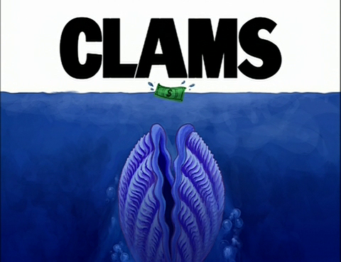

A "Jaws" parody, front and center. This kind of stuff tickles my fancy.


Very different from all the other SB title cards, being very plain. I like it.
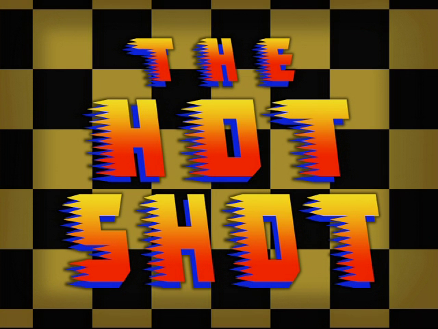

Groovy lettering that perfectly fits the episode's content.
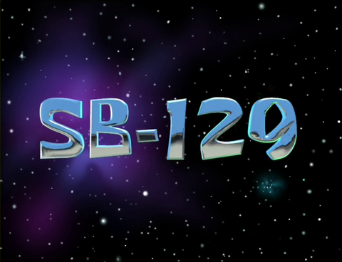


Because title cards are always better if they're animated.
 
205_thumb.jpg
549_thumb.jpg
3_thumb.jpg
2_thumb.jpg


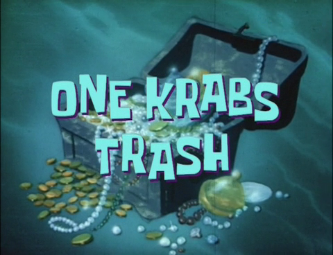
The first one is pretty self-explanatory. I like Oral Report and Frankendoodle because I like doodle collages, and One Krabs Trash is cool because of the animation.
 
pOXHwaP.jpg
Its not a title card but a time card. It looks "radical" and they should use the design as a actual title card in a episode some day.
 
S1:
Besides the obvious SB-129, FUN has one I loved how they had the patterned font with the black background, very clever!

S2:
Prehibernation Week takes the cake. A very awesome title card. The moving background compliments the simple text.

S3:
Clams wins this round! Great parody title card.

S4:
All that Glitters. Although I hate the episode, the title card looks very attractive.

S5:
Friend or Foe. Depicts the episode nicely, and I like how Krabs and Plankton are both smiling.

S6:
The winner is.....House Fancy! I am drawn to the beauty and sophistication of the title card and font.

S7:
Spongebob's Last Stand. The creativity put into the title card is marvelous.

S8:

It's a Spongebob Christmas! Very cute font, and the backgrounds depicts the nature of the episode as well

S9:
Séance Schmeance's title card is glowy and very artistic!
 
I always liked Krab Borg because of the robot voice. And it looks really interesting and detailed. I wish it was animated though, they could have made the lights blink or something.

 
Back
Top