Art style changes in other shows

Original Raw and Uncut

Two-Headed Starfish
This time I'm gonna dig deeper on how other shows change their art style over time. We've already covered Spongebob, and I'm tired of it. This time aorund I'm gonna start off with older cartoons and adult programs:

Let's start off with Tom & Jerry

Early-1940s MGM era:
7739541c15073e54ba3f0735a140302e.jpg


Tom and Jerry is one of the oldest cartoons in existence. The films started out with realistic animal sounds and movement. Very dull coloring (Due to the film processing technology at the time) Tom's head is less oblong and more round, and Jerry is more plump

Mid-to-Late 1940s MGM era:
58b1480d252282f504483043d9cc4c6d.jpg


Most common look to Tom and Jerry, a good chunk of the shorts in this era had this look, basic smooth tom and jerry look, although not as fluent as the earlier half of the decade

1950s Cinemascope era:

4f1f0fb79479657b7d88d6c83595717d.jpg


Tom is more of a blueish tint, the designs have became more streamlined. Episodes aren't as fluent, and films are now cheaper to produce

Early 1960s Gene Deitch:

9272bbdd4cdcd09b71fcf8f2d97f50ac.jpg


Cheap animation that has a Saturday morning feel, rigid movements, and eirre electronically produced sound effects. Designs are even more streamlined, combined with choppy stiff movement

Mid-to-Late 1960s Chuck Jones:

40d517da4d5413f960a78d548b098dc4.jpg


Rigid, but very expressive animation, sharper look to it, and the erie sound effects are gone. Tom and Jerry look chunkier


Johnny Test

First Season: (2005) Digital ink and paint

afcf6971c44aa135c648781eb11f1cf6.jpg


Crisp think lines, with decent movement, good look. Dmmier colors. May be slightly blocky, but some things are round

Everything Else: (2006-2012) Flash

c187072eec2a3ec538333ecca4c38503.jpg


Rigid, rubbery, robotic-like movement, eye-peircingly bright colors, and uncanny animation. Jagged lines


Gumball

First Season (2011)

4ea669e23e5f10b5e4e8ba982464bbd6.jpg


Blocky, less streamlined animation, more expensive, although limited, thinner lines, shadows, and flat-looking drawings. The animation here is more hand drawn


Everything Else:
851f01fb4d8de38b09b9ba9b2c06d58e.jpg


Thicker lines, everything is round without a single point or edge like Season 1. Shadows are gone, animation is better and more realistic, although facail expressions are more limited
 
Dexter's Laboratory

This shows animation gradually gets more and more streamlined as the show goes on:

Season 1 (1996) traditional cel animation

8b73f690d348d39ef7f7847abae889cf.jpg


Season 1 has duller color, thick lines, very expressive animation, and it looks like Dexter's body is pointer. Dee- Dee also has a longer giraffe like neck. Charcaters also have very smooth Disney like movement and activity. Colors tend to be very dirty.

Season 2 (1997-1998) traditional cel animation

8c62aad644674b781c3f6c6905d807ad.jpg


This season, slightly differs from the first, except the characters are more refined. Dexter's body is slimmer, his hair is red now, instead of Orange. Dee-Dee's head is wider, but her neck is still kind of long. Although it's more ridgid, it still retains the fluently animated activity of Season 1. The outlines are also more bold

Ego Trip (1999) traditional cel animation

ed2462376e0a757c89fcaea1d8f7e765.jpg


This looks like a cel-animated version of the post-reveival series. Dexter's body is more proportionate, his hair is a darker shade of red. Still, this retains the dark color of the cel animation. other characters also look more prropertainet, but we'll get into that, later. We still have good drawings and cel animation

Season 3 (2001) digital ink-and-paint

d95375217829ada4fafd2e51aaf679c7.jpg


Woah, the colors look very clean now. It looks like they've tweaked out the animation a lot. Why, without a doubt, the show is now digitally colored, instead of being painted by hand, like the first two seasons and Ego Trip. Dexter's more square-like, his sister Dee-Dee's head now shapes like a stump, and the long neck is gone, and her pupils don't overlap anymore, also due to the show no longer being animated with cels. The problem I have here is that this is not as fluent as the first two seasons. Plus, the drawings are more basic. The skin tones are more realistic, due to the switch to digital coloring. The colors although are cleaner, you can tell the the animators were still used to the cel-based style of the first two seasons and Ego Trip. They'll adjust, don't worry

Season 4 (2002-2003) digital ink-and- paint

11e0c9029eb11881f461dc0b435ac68d.jpg


This looks like a sleaker, more modernized version of the previous season. The animators seemed to have gotten all the kinks out from the new digital coloring software. The animaton is even cleaner than before, and looks a couple years ahead of it's time. Dexter's hair is orange again (Guess it changes color every other season) and Dee-Dee looks the same, except not as blocky as season 3, and she's shaded more realistically, The colors are also sharper and more variant, it doesn't strain your eyes like the third season did. It's hard to tell these seasons apart until you get a closer look, but there's a no-brainer difference between the cel animated seasons of the '90s, and the digitally rendered ones of the early-2000s
 
I'll vouch.

Uncle Grandpa

Early Season 1 (2013-early 2014)
Uncle.Grandpa.S01E08.jpg

The background is more crude, the outline is more thicker, and the design is more expressive, my favorite era of design.

Rest of Season 1 - Season 3 (mid 2014-2016)
Uncle.Grandpa.S02E46.jpg

The background is more straight, the outline is less thicker, and the design is more on-model, but still with stretchy animation.

Season 4 - present (2016-)
unclegrandpa_clip_128_01_640x360.jpg

The background is more smooth and colorful, the outline is the thickest, and the design is the same as the second one, my favorite era of backgrounds.

The Looney Tunes Show

Season 1 (2011-2012)
looney-tunes-520-1.jpg

The model is more stylized, and the background is also stylized, and the color is dimmed.

Season 2 (2012-2014?)
tlts_209.png

The model is less stylized, and mostly resembles the defined design of the characters, the background is still stylized, and the color is more vivid.
 
The Simpsons

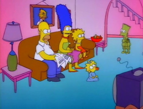
The Tracey Ullman Show (1987-1989)
hqdefault.jpg

Real realistic movement, looser designs, and various models are reused throughout the shorts. The kitchen looks very different to how it is in the series and the house's geometry isn't well defined.
Season 1 (1989-1990)
Simpsons_0102b.jpg

Definitely looks a lot cleaner than the Tracey Ullman shorts, though there are still some issues. There's a different kitchen again in Bart the Genius, Homer's Odyssey and There's No Disgrace Like Home, as well as the original cut of Some Enchanted Evening, characters tend to have a little line at their edge of their jaw for extra emotion, and the backgrounds are faded for the first 4 episodes (in production order). Also, a different intro.
Season 2-3 (1990-1992)
bloodfeud8_thumb.png

The intro is refined to be slightly shorter, and some of the quirks of Season 1 slowly fade throughout the first part of Season 2.
Season 4-8 (1992-1998)
homer-the-vigilante15.png

The animation studio is switched from Klasky-Csupo to Film Roman, resulting in animation that much better fits the comedy of the show, but results in less varied dresses for the characters.
Season 9-13 (1997-2002)
hqdefault.jpg

As camera technology evolves, the colours become more vibrant, adding to the idea that The Simpsons became cartoonier during this era.
Season 14-19 (2002-2009)
The-Simpsons-Season-16-Episode-9-3-82dd.jpg

The series switches from traditional animation to digital ink and paint. It makes the lines look more crisp and the movements a lot more fluid.
The Simpsons Movie (2007)
simpsonsmovie1280-1473448681312_1280w.jpg

Animated in a 1:33:1 aspect ratio as opposed to 4:3, it allows for larger shots and more complicated cinematography.
Season 20-28 (2009-2017)
simpsons-couch-640x360.jpg

The show's permanent transition to 16:9 HD comes with a new intro and some improvments over the previous evolution, but not much has changed in 8 years.
The Simpsons Guy (2014)
familyguy1_3363686b.jpg

Looks different to the show proper, stiffer animation and less expressions, because it was animated by the Family Guy crew.
 
Fairly OddParents? Sure, the main series may look similar, but look into the art changes of each season. Also wouldn't mind Family Guy too.

EmployeeAMillion said:
The Simpsons
Season 14-19 (2002-2009)
The-Simpsons-Season-16-Episode-9-3-82dd.jpg

The series switches from traditional animation to digital ink and paint. It makes the lines look more crisp and the movements a lot more fluid.

Season 20-28 (2009-2017)
simpsons-couch-640x360.jpg

The show's permanent transition to 16:9 HD comes with a new intro and some improvments over the previous evolution, but not much has changed in 8 years.
Seasons 19-20a of The Simpsons had an art style that was identical to the HD episodes, however was SD. You can notice that since the designs look lighter and there is more of a lack of shadows.

I feel like some minor improvements have been made later on, but I don't know. The HD changeovers were new in 2009.
 
Veggie Tales

Unless you grew up in a religious household, this show is unheard of to most

1993-1999 (VHS era)

7aed9a12e03d8165b37dff3ec5c40ee5.jpg


Crude CGI animation, due to the primative computer software of the 90s. Larry is a darker shade of green and is more pickle-like, and Bob is crudley shaped

2000-2013

6ba6e51223913fed300788ac3e8a6d79.jpg


Larry is now a lighter shade of green and more cucumber like, and Bob is a perfectly round tomato. Animation is less crude, more fluent, and more realistic. Upgraded computer software

2013-Present (In the House)

fe83d658c607fe1603a9968d54118602.jpg


The designs are more fluent, although hideous, the gentlemen now have pupils, and the characters have a more cratoony and oblong appearance. They should've stuck with the old designs
 
Regular Show

2009 Pilot
505628f0d8985ae173a007972d1abca3.jpg


Bold thick lines, fluent animation, very expressive faces, and off-model movement, and funny wild animation

Season 1 (2010)
e658db5e926a6616102cb421453a894a.jpg


Bold Jagged thick lines, off-model expressions , and fun animaton, very fluent, slightly more refined than the pilot

Season 2 to Mid-Season 3 (2011-2012)
6eed34930e9bbbdb48df16ee51317777.jpg


The off-model animation is gone, but there is still fluent animation, this is the best animated portion of the series. Characters are on-model, but still very fluent with a lot of fun activity

Late-Season 3 & The entirety of Season 4 (2012-2013)
8a5b624dfd02dd27ea8d542277b0d95e.jpg


The stiffness starts to kick in, not lazy looking, the fun animation is completely gone, and the animation becomes very stale and boring, headache inducingly boring. The outlines also become thinner


Season 5 to Season 8 (2013-2017)
ff7454d388c9e8910a72dc8420e85778.jpg


Stiff lazy animation, characters are drawn chunkier, and the outlines are very thin. Dull to look at, and the animation looks rushed. Boring and dul, the colors also become duller
I thought you were tired of talking about animation of RS.
 
Back
Top